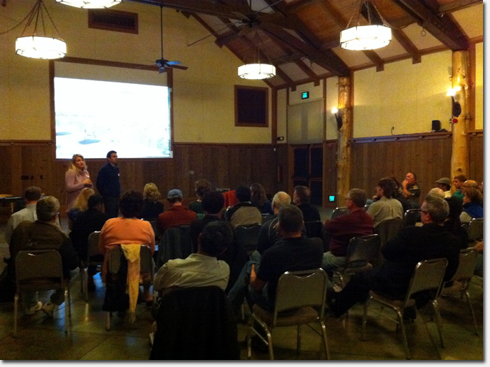
On Monday night, Safeway hosted a public meeting at the Great Hall of the SF Zoo to share their latest architectural plans for the La Playa/Ocean Beach Safeway. About 30 residents attended along with Les Hilger, an aide from Supervisor Mar’s office.
Many of those at the meeting live immediately adjacent to the supermarket on La Playa, Cabrillo and 48th Avenue. Safeway has held two public meetings already this year where they heard feedback from neighbors about their concerns with the initial design.
Known as the “podium design”, the initial proposal raised the ire of many neighbors for its scale. The design centered around a 66 foot high entrance at the corner of La Playa and Fulton, and neighbors on the 48th Avenue side complained that the 27 foot wall on the east side would block their light and views. Those same neighbors were concerned about the loading dock being located on 48th Avenue and the potential traffic hazards that Safeway’s daily deliveries would cause.
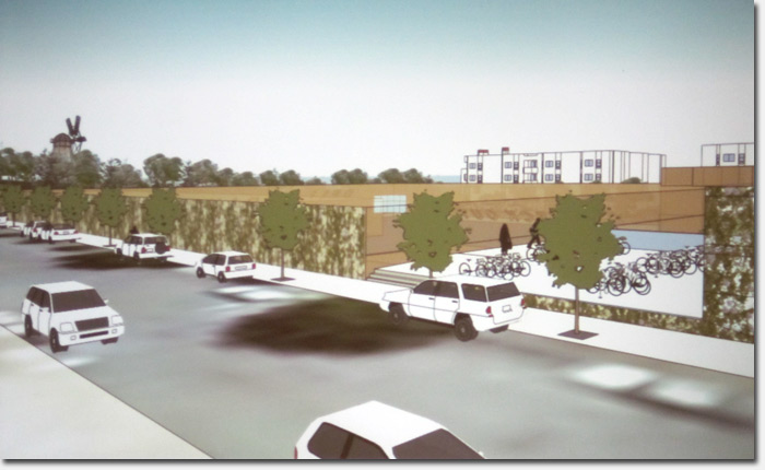
In Monday night’s meeting, Safeway revealed a new design that addressed many of the neighborhood’s concerns with the first proposal. The new proposal was presented in high tech style with the aid of a 2D simulation video that walked viewers down each side of the supermarket and around the block.
In the video above, lead architect Ken Lowney of Lowney Architects narrates the walkthrough. Highlights include:
- A maximum height of 20 feet, 6 inches on the west side of the building which faces La Playa, substantially lower than the 60 feet originally proposed.
- An underground loading dock that is accessed from the La Playa street side. This is a first for any Safeway store and was designed to reduce noise and traffic hazards for surrounding residents.
- A 3,500 retail space on the corner of Cabrillo and La Playa. Too early to say who or what would occupy it.
- Two entrances on 48th Avenue to a street level parking lot that is bordered by 10 foot trellis fencing. Below that lot is the underground loading dock and an additional 100 spaces of parking. The two levels are connected with stairways.
- A whole lot of bike parking on the upper level for all the beach cruisers
- A mere 12 foot wall on the east side (48th Avenue), less than half the height of the 27 foot wall in the first proposal.
The main entrance to the store is via the La Playa street entrance halfway down the block; a secondary, smaller entrance would be open on the corner of La Playa and Fulton.
Some attendees raised concerns about pedestrians mixing with cars and semi trucks in the main entryway. Lowney said that it’s quite normal for that to occur on retail supermarket sites and Safeway Real Estate manager Natalie Mattei pointed out that the volume of deliveries is low – only 4 Safeway semi’s per day and about 20 small trucks – which are also subject to restricted hours. In other words, shoppers shouldn’t feel like they’re in a game of Frogger as they cross from the parking lot to the entrance.
Several neighbors in the meeting were treated to realistic views of the design from their living room windows, thanks to the video simulation. With a few clicks, one resident on 48th Avenue could see a realistic view of what the landscape and store would look like from the second and third floors of his house. He was pleased he could still see the blue ocean and the park’s Dutch windmill very easily.

A view from the second floor window of a house on 48th Avenue
Compared to today’s La Playa Safeway which tops out 39,000 square feet, the remodeled store would accomodate 65,000 square feet of retail space. That’s a footprint of 58,000 square feet with an interior mezzanine that accounts for another 7,000. The store would have 200 parking spaces with entry to the lots on both the La Playa and 48th Avenue sides.
The video tour includes white blocks that represent residential developments along La Playa and Cabrillo which is also part of the project. Safeway owns the entire square block right now, but would sell off a portion to a developer to build residential units. The original plan envisioned condos, but this new layout incorporates 35 foot high and 35 foot deep townhomes that would have their own parking.
Some residents were concerned about what occupy the space in the event that Safeway could not find a buyer, or the land was purchased by another party but never developed. In the new plan, the townhomes are attractive to the La Playa neighbors because they effectively block the parking lot, including its 24 hour noise. “What would go there? More parking?” asked one neighbor.
Ideally, Safeway said, they would sell the land and a developer would build in tandem with the store’s remodeling. However if that did not occur and the property went unused, they vowed to work with the neighborhood to find a suitable use for it other than parking.
The La Playa Safeway will not close during its remodel, which is expected to take 10 months. Instead, Safeway will build a new store alongside the old, open the new store, then tear down the old one in a phased approach. There is no word yet on when Safeway would start construction; they have yet to submit any final plans to the city.
For more information on the La Playa/Ocean Beach Safeway remodel, visit the project website at safewayonlaplayasf.com. The site includes updates on the project, a way to contact the project leaders, and the latest designs.
What do you think of this new design? Leave a comment to let us know.
Sarah B.

About 30 residents showed up at the meeting which was held in the Great Hall of the SF Zoo
It should be obvious that no matter what the final design , there will always be negative responses from the career whiners, complainers, and moaners.
Looks pretty good…
I dunno about this one … it seems like there’s just a big blank wall facing the street, which is pretty much a pedestrian-killer. Is there no way to have sidewalk-accessible features, like a newsstand or more doors or some benches or a parklet or bike racks or windows or more stores?
Hi Matt – The renderings are purposely vague as they are meant to communicate a layout for discussion more than an aesthetic look; there’s still much design work to come. There will be landscaping etc. and the white “boxes” are meant to represent townhomes which will look more residential.
There are bike racks on the upper parking lot area, set off just from the street.
Sarah B.
Obviously, no matter what the final design is, there will be negative responses, but from constructive criticism we might actually assist the design team in creating something that might appease the fair and reasonable people . I am a homeowner on the La Playa side of the street and found the first renderings to be quite soothing to the eye, representative of the area that we live in and architecturally significant, but am also sympathetic to those whose views might have been hindered from that design. My question now is, how could we go from that to this. It seems a little extreme and unfair to those of us who will actually live here for a long to come, to now embrace a wall with some landscaping on it. We live on Ocean Beach for a reason and I hope your design team truly understands and honors that.
@Harry – Please see my first comment above yours. These are very loose renderings with no design aesthetic on purpose – they are meant for discussion of the layout, not the look of the buildings.
Sarah B.
I hope Safeway and their architect take into account the overall “beachy” aesthetic of this area of San Francisco. It’s not the Marina District or SoMa; an unobstrusive architectural design might make more sense as opposed to the original design that, I believe, didn’t really suit the existing neighborhood. Otherwise I think the low height proposal is a good step in the right direction. I hope they do a lot of nice landscaping on all four sides.
This looks about as good as I could imagine the remodel being. It seems to fit well visually, and the way it’s laid out feels like a good use of space to me.
Go for the low-key beach design as Paul suggests and I’m sold.