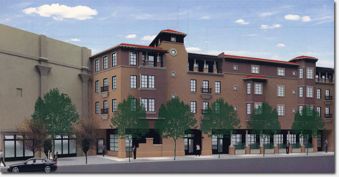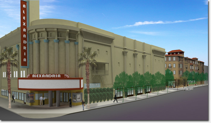
The proposed residential apartments that would be built on the lot behind the Alexandria on 18th Avenue
The agenda has been set for the meeting this Friday night regarding the Alexandria Theater development project, which begins at 6pm at the Richmond District YMCA on 18th Avenue.
Mary Woods from the Planning Department will be there to explain the process for moving the plans through city channels, and members of the ownership group and architects will be there to present the plans and answer questions.
We were also provided with a more complete PDF of the development’s plans, which includes an illustration of the residential apartments that would be built on the back lot on 18th Avenue. The first level of that residential complex would be retail space, with parking underground for residents and shoppers.
The document also includes schematics of the first and second floor of the theater building, which as discussed in the past, would house retail stores on the first level, with a 211 seat theater and a full service restaurant on the second level. The design features open walkways on both sides of the interior of the building so when you’re on the second level, you can see down to below.
Original architectural elements of the art deco building would be preserved, including the domed roof that was part of the original theater before it was sectioned off when it became a multiplex. The ornamental decoration on the facade of the theater building would also remain, including the blade sign (though the 1-2-3 numbers would be removed from the sign, an addition made in 1976).
The plans also indicated that some (or all?) of the original murals inside the building would also be preserved and on view.
To get all the details about the Alexandria development, and ask questions of the developers and architects, stop by the meeting tomorrow night from 6pm until 8pm. We hear snacks will even be provided.
Sarah B.
MEETING AGENDA
6:00-6:10 Seating
6:10-6:15 Eric Mar: Introductions
6:15-6:25 Mary Woods: Explaining the process
6:25-7:00 Ownership Group and Jonathan Pearlman, ELEVATIONarchitects: Description
7:00-8:00 Audience questions


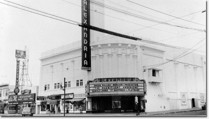
The Alexandria Theater, 1942
6:00 on a Friday night…really?
Build this. Build something. Build anything. Just make it end!
i like how the rendering makes 18th ave more wide and flat than it actually is.
It’s great that something’s on the drawing boards for this site. But be careful what you wish for. I’ve heard from reliable sources that the City wants to significantly increase the density of housing in the Richmond. Could this be the camel’s nose under the tent?
Thanks for the comments, everyone.
As far as the timing, yes, it’s not ideal. But between getting all the parties there and having a space at the YMCA (where we really wanted to hold the meeting) there weren’t any other times that worked. We will have full details of the meeting for those who can’t make it out.
As to the density issue– no secret plan! This project didn’t change any zoning regulations; it has a similar density to the Central Richmond norm, and no changes were made to increase the limits for this project.
You might also be interested to know the first design was for 46 residential units, while the new plan calls for 37. The units are a bit larger so families can fit.
I hope this helps!
Peter Lauterborn
Legislative Aide
Supervisor Eric Mar
Works for me! And I’m pretty anti-development. My only issue is that the dark coloring of the apartment complex is more Presidio than Richmond.
Will the theater building be a movie theater or multi-use, like Oakland’s Paramount?
Drawings can be deceiving. What kind of signage will the retail stores have. Will these stores be a Bridal Shop featuring gaudy wedding gowns, nail salons, produce, a Walgreens popup store, another Sushi restaurant, and a Slap Massage parlor. Geary St is already looking very junky and lacks the kind of businesses you find in the Inner Sunset.
I could not agree more, on Geary/Clement 30-15 blocks in particular. We really need another sort of businesses in the area, and I also wonder if there are any rules on signage and appearance? And if yes what are they?
So, those residential units are for rental, not condos?
Kind of a waste of an empty lot – should be 6-8 stories at least, to help add some much needed density to the area.
Ugh. Looks like Santa Row. But more bland, if that’s possible. And I’m guessing cheap construction.
Ugh. Looks like Santana Row. But more bland, if that’s possible. And I’m guessing cheap construction.
Great comments, everyone! Thank you for them.
Re: the type of stores. One thing that came out of Friday’s meeting is that they can’t search for tenets until the building is approved. So we can’t know what sort of signage will go up or what type of company might move in.
Re: the type of signage. The rules that control signage in the rest of the Richmond would apply. If they wanted an exception, they’d have to ask the planning Commission.
Re: rentals or condos. The owners want condos, and to he degree I understand, this is their discretion.
As far as the density–some want it less dense and some want it more. This project is right in the middle of what’s allowed. No more, and no less.
Hope these comments help, and I am happy to keep responding to posts on this issue.
It’s great to see that space finally put to good use. I am especially happy that the theater is being well preserved with signage and all as it really is a Richmond District landmark. I agree with bill that the height of the apartment building should be taller, but as a whole the richmond really needs to start developing high rise apartments across from GG park which is its best asset.
I’m so happy to see this. We live right down the street and the blight on that corner has been relentless. Is there anything neighbors can do to speed the process?
In the theater portion, it seems weird that so much space is used for corridors. They don’t seem necessary– especially the one in the back. It doesn’t seem like anyone will ever have a reason to go there, since all the entrances are on the other side, and that it will eventually be turned into makeshift storage for the retail, for lack of any better use. The front corridor simply follows the sidewalk, so there’s no real reason for anyone to use that either. It reminds me of the Metreon, which had lots of confusing empty spaces.
Hopefully whoever occupies the space will figure out how to put it to good use.
As far as the new building is concerned, would it be so terrible to have a bit more symmetry and regularity? Why are the two bay windows different heights? Why the section that sticks out ever so slightly on the left? Is there some quota for some number of different architectural features you have to pack into a building? The old folks home which replaced the Coronet is a big offender in this regard.
I am curious, at the Candidate’s Forum tonight, Mar mentioned a 7,000 square foot restaurant. What restaurant of this size is going to be able to go into this location? Also, was space allocation for another restaurant really needed when their so many other restaurants and vacant locationst? If I heard wrong at the meeting, feel free to correct me.
Correction: “…there are so many other restaurants and vacant locations.”