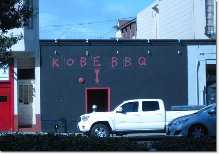
The “You Are Here” style signage on the new Kobe BBQ. Photo by Derek
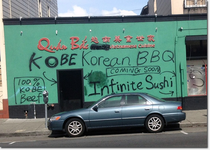
Last week, BoldItalic published a photo of what was once Quan Bac, a popular Vietnamese restaurant located at 4116 Geary between 5th and 6th Avenues. The photo showed what one might call a “poor man’s restaurant sign” which looked like a spastic graffiti artist had come through (photo below) – and even spelled one of the restaurant names wrong.
It appears the restaurant space is being divided into two eateries – Kobe Korean BBQ and Infiniti Sushi.
Thankfully, the graffiti was quickly painted over within a day or so with dark paint. But today, we received new photos of the facades which are, well, still pretty bad.
The Kobe BBQ storefront on the left side has spray-painted letters with an arrow pointing down at the front door (just in case you don’t know where to go in). It’s a little reminiscent of the “You Are Here” notations on venue maps.
Next door, they seem undecided on how they want to sign the place. “Infiniti Sushi” is lettered on a small wood board that runs across the front, but “Infin” is still spray-painted haphazardly above the windows (and S-U-S-H-I remains spray-painted on the window coverings).
We don’t know anything about these restaurants or when they plan to open their doors. We’ll hope these signs are works in progress because if they’re permanent, we can only assume the quality of the food will be top-notch. 😉
Oh and Brothers Korean BBQ is right next door so let the games begin.
Sarah B.

The current signage for Infiniti Sushi, opening next door. Photo by Derek

How the graffiti’d facade looked last week. Photo by Bolditalic
The first one is pretty ghetto, but I dig the evolution, and as Capt. Jack Black says…”Ah, but you have heard of me!”
The first one was funny.
The new one’s not bad. There’s only so much you can do with a big flat wall.
They are “sister” restaurants to Kaiju Eats, also on Geary between Stanyan & Beaumont, according to another handwritten sign in their window.
I like the new one. It stood out to me yesterday when my bus passed and I thought about it for awhile.
Not the first time more than one food establishment occupied a single building out this way.
Vera’s Place (great piroshki, handmade and fried in a deep cast iron skillet for each order, not just reheating pre-made) shared a building with a donut joint. If one had any questions about the menu on Vera’s wall, the only thing she would make for you was a tuna sandwich. “For you, tuna sandwich.” This was eons before Seinfeld.
Pretty amazing signage. I confess I have missed it so far. Bouncing off Alai’s remark, lthough the left side has been a big flat wall for many years, about 15-20 years ago, Cafe Riggio, or was it Rigolo, had a big mural of a reclining jester, and the fire alarm bell was one of the bells on his cap. (A later mural didn’t have quite the same panache).
Here’s the only image I could find of said mural
http://www.septembrestudio.com/press/files/stacks_image_314.jpg
That jester used to creep me out!