Photos: de Young Museum – CTG/SF | Academy of Sciences –Steven Perry
Ever since the de Young and Academy of Sciences in Golden Gate Park completed their renovations and re-opened their doors to the public, people have been debating the merit of each one’s style.
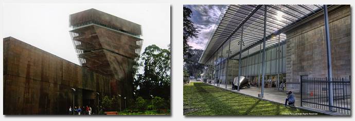
Their architectural styles could not be more different, with the de Young sitting like a dark, metal lockbox in the park, complete with a tower that juts up into the airspace over the Richmond District. Contrast that with the Academy with its more classical facade, green innovations and bright, airy interiors.
They were designed by different architects – the de Young by Swiss architects Herzog and de Meuron, and the Academy by Italian architect Renzo Piano. The two museums serve different audiences and display very different things, and their opposing structures on each side of the concourse make for an odd pairing.
Architect Glenn Lym put his thoughts into a video where he examines the two structures in more detail. His starting point: “To me, the most interesting aspects of these buildings is not how they raise the bar for design in an architecturally parochial San Francisco. Rather, what interests me is how both buildings are fundamental opposites of each other and embrace as well as ignore the park in completely different ways.”
It’s not a short examination, but if you’re into architecture and how it impacts the environment in which it sits, you’ll find Lym’s analysis interesting.
What do you think of the two buildings? Leave your thoughts in the comments.
Sarah B.
[via Inside the Outside Lands]
I like both museums and their juxtaposition to each other, though it should be noted that Herzog had a clean slate and a vacant site to work with when designing the De Young, where Renzo had to work his Academy design in context with a portion of the old academys’ building.
I think Renzo’s design works very well in that context and may have been a more challenging design exercise. Herzog’s design, which is arguably well designed, will forever be controversial because of its contemporary starkness in a park setting.
They both, however have transformed the park and brought lots of visitors & culture to our great city.
I like the Academy of Sciences building very much — maybe it helped that the architect had to work with an existing building.
Although INSIDE, the deYoung is beautiful, the outside is too big for the site and I think it’s ugly. Every time I see it I feel like the architect is jamming his thumb in my eye.
Did you notice that, a little bit after 4:20 into the first video, the dude driving whomever’s filming (let’s hope it’s not the driver who is also filming) doesn’t stop at the stop sign and doesn’t even slow down for the dude he almost runs over? Like, what the ****?! Plus, he seems to be driving a tad too fast.
It gets me thinking how the footage of driving is disruptive since parks aren’t for driving, but for walking and biking. Unintentionally, this distracted driver footage becomes a play with in a play on how cars don’t belong in GGP.
Adam, our family lived two blocks from GGP and we drove EVERY TIME to the Academy/Tea Garden/Playground. We averaged a visit a week. If cars had been 100% banned back then there is NO WAY my parents would have walked further than the Rose Garden, resulting in a drastic reduction in use and thus a drastic lack of appreciation for the Park.
But I digress. The deYoung makes me think of an abandoned Rust Belt warehouse. I have not been in either new facility because I can’t afford the entry fees.
Yes, Tammy A, my comment could have included the caveat that there should be infrastructure implemented for the disabled and elderly. Such could be accomodated similar to disabled parking spaces, by the way of parking permits where people with those permits can be allowed into parking designated for them. I totally advocate for those types of accomodations. With that caveat, I still find the modern day belief that parking should be available for everyone and underpriced, as the expectations are now, as something we need to think differently about. Especially in a park. I applaud and support workarounds for those with mobility limitations, but more and more, I am seeing so many infrastructure, cost, and energy problems w/ providing car access for everyone and the parking needs that go with that call for everyday car access.
I’m like the worst blog commenter, because I always re-think how I could have said things better. So apologize for the multiple posts here, but something I should have included initially is how, part of what the video-creator here talks about is how the plaza between the two museums doesn’t really connect them well. I think part of this has to do with the design parameters that required the accommodation of cars. The circular street obstructs such a street-less connection between the museum and the plaza that would be more desirable. If there was more of a public transit focus rather than individual car focus, those design disjunctures could have possibly been addressed differently. I do appreciate that the parking is underground. An above ground parking garage would have been a monstrosity.
That said, the design for cars could have been much, much worse. It’s present status does help calm cars down, the car in this video, hopefully, being the exception.