The Richmond District Neighborhood Center has undergone a re-branding, resulting in a new name, a new richmondsf.org URL, and a new logo:
The Richmond District Neighborhood Center. revealed new branding designed to better reflect its comprehensive programs for more than 5,000 youth, families, and seniors.
The Richmond Neighborhood Center has served San Francisco’s Richmond District for nearly 40 years, offering dozens of programs for youth, families and seniors. Central to the new logo—an outline of the neighborhood itself—is an elevated “O” representing the inclusion of the many cultures, ethnic backgrounds, ages, and community interests that make up the Richmond District as a whole.
“Our programs have expanded over the years to include a wide array of services, from after
school programs and food pantries to adult wellness classes and neighborhood festivals,” said
Executive Director Michelle Cusano. “With this new brand design, we wanted to bring all of our
work together under a logo that really captured the diversity of the Richmond.”
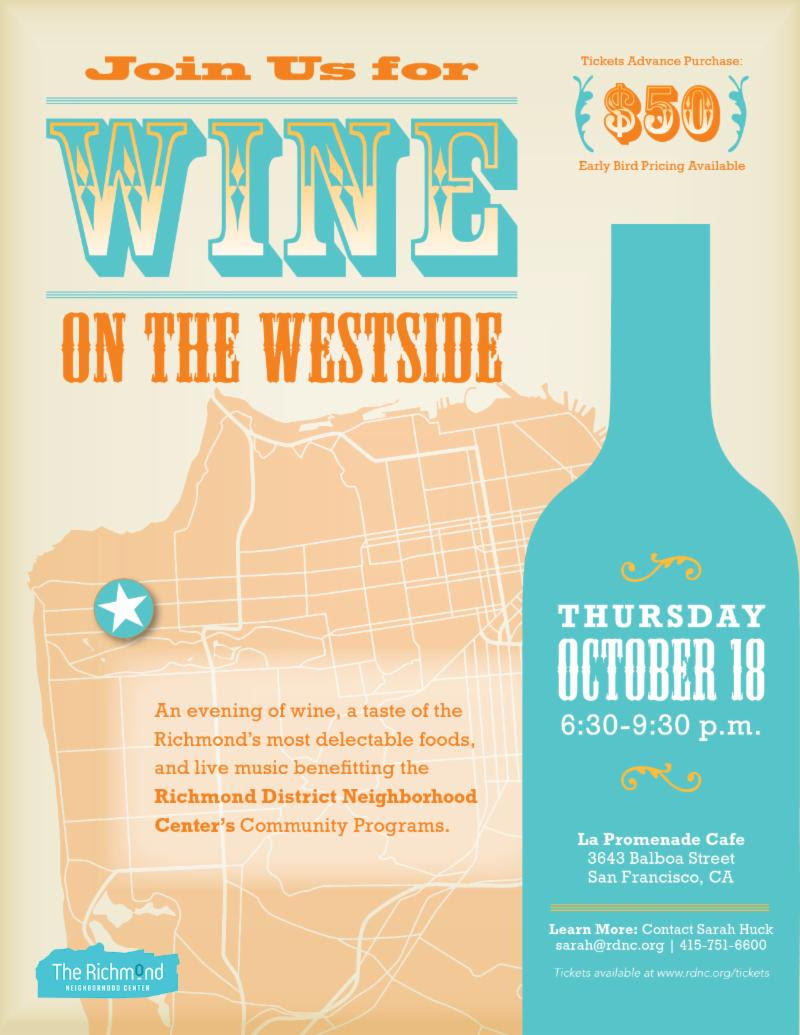
Wine on the Westside Fundraiser, October 18
On Thursday, October 18, the Richmond Neighborhood Center will host their annual Wine on the Westside fundraiser featuring an evening of wine, a taste of the Richmond’s most delectable foods, and live music. The event is $50 per person and takes place at La Promenade Cafe (3843 Balboa). Tickets are available online.
THEY’VE RENAMED THE RICHMOND DISTRICT “THE RICHMOND” TO SUIT THEMSELVES.
I’ve been staring at it for 5 minutes now and can’t figure out the significance of the design the “o” in “Richmond.” Would someone please explain it to me, thanks.
Maybe I’m just getting old …
wow, the logo certainly doesn’t show the stated goals. Now their initials will be the same as that of the Republican National Committee, too.
I was at a public input meeting and *everyone* hated the new logo, although to be honest there were only 5 or 6 of us there. They talked about how the “O” was representative of this & that… none of us saw any of it. One thing it was supposed to be was a warm embrace… looks more like Trump’s wall or NIMBY-ism to me.
I was there when the house logo was created and adopted in back in the turn of the century, when strategic planning was in vogue … it’s a new dawn, a new day, a new regime…